Followers

Sunday 16 December 2012

Part 10: Artist Statement

Emma Illerbrunn
Formosa, Ontario, Canada
emma_12@live.ca

Artist Statement
     I believe that when creating a piece of art you should be as creative and expressive as possible; your artwork should be a reflection of yourself.  However, I believe that expression is not just limited to the kind of art that you create, but that you can express yourself through techniques, colours, etc.  I was inspired to create art by need for self expression and creativity.  As an artist I wish to show my viewers who I am through my art pieces.

     To make my art, I try to always have fun, since I find that this makes the piece more creative and expressive.  I also find that by having fun while creating art, you will be happier with the end result; I know that I am.  When starting a new piece I like to start with a very basic idea as to how I'd like my piece to look and I work from there.  However, I very rarely follow my original idea since as I work through the project I get new ideas or inspirations that pull me in different directions. I also like to try new techniques and/or programs when working on different projects, so that I can keep my art pieces different and interesting for the viewers.

     For my most recent pieces, I was really inspired to show that all people in our world are equal and deserve to be treated that way.  In the recent piece I have done I feel that the piece that shows this in the most interesting way would be my culture jammer, Pepsi Next With Babies.  I truly feel that this piece, through exploiting the tragic use of aborted babies in Pepsi drinks, shows that people are not treated equally because of their development.  
Monday 10 December 2012

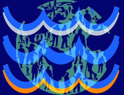
One World Flag Reflection

Technical
For this assignment I used a lot of my previous knowledge of photo shop techniques.  For example turning a photo into a brush, which I used for the people that I erased out of the earth.  I also used the layer blending option to change the style of the layer.  I used this technique on the vector of the world so that you were able to see it through the the coloured waves.  I also used the shape tool to create the water waves in my flag.

Idea/Concept
The idea that I eventually used for this assignment was to show that throughout the world people are equal and connected.  I showed equality through the people in the world, by showing people of different age groups in different sizes throughout the world.  To show the connectedness of the world I tried to incorporate the four elements through the water symbol and the colour I used in my flag.  While doing this assignment my idea changed a lot since at the beginning I had almost no idea of how I wanted this to look.  From the beginning I knew that I wanted to show that the world was connected in different ways and that everyone in the world was equal.  The original idea that I had started with was to show that everyone was equal by hands around the earth in different colours.  However this idea was extremely complicated and I was having troubles making the image look connected.  So in the end I decided to show equality through the people in the world, and show that they are connected through the elements. 

Influences
For this project there was no particular artist that influenced me.  However, I was really influenced by wanting to show equality of all people of different races, cultures, ages, disabilities etc. 

Composition
For this assignment I balanced my flag symmetrically.  I think that by balancing it symmetrically it helps keep my flag look simple as it is supposed to.  In this assignment I put emphasis on the waves of water by making them the largest item of the flag and by putting them at the front.  However, you can still see the world in the back due to the layer blend.  The layer blend also helps to move your eye around because even though you automatically see the water waves, your eye is drawn to the background of the picture since you can see it through the waves. 

Motivation
Beyond fulfilling the requirements for this assignment, I was motivated to show that even though there is poor countries in the world, everyone is equal and connected in some way.  I was motivated to show this because some times people forget about these poorer countries and just believe that our world is connected through Internet or phone; although not all countries or people in the world have these luxuries.  So I was motivated to show that the people and countries in our world are connected by much simpler things, for example the 4 elements.

Critical Assessment
I feel that the most successful and interesting element of my piece is waves of water in the front.  I think this because it does an excellent job of showing the elements through the shape and through the colours used.  The one thing that surprised me was how well changing the layer blend of the world connected the piece.  This surprised me because before I changed the layer blend I thought that making the piece come together would be extremely difficult because the pieces did not look connected, and then when I changed it, they looked like one.  With additional time I wouldn't change or add anything because I think that if I changed anything it would look to complicated. 

Monday 3 December 2012

Part 9: Art Resume

Emma Illerbrunn
Formosa Ontario, Canada
emma_12@live.ca
ww.krop.com/emmart12

Education

2009-Present: Sacred Heart High School
          Grade 9, 10, 11 Visual Arts
          Grade 11, 12 Media Arts


Employment

Summer 2011: Babysitting
          Teaching kids painting techniques and colour combinations

Summer 2012: M&R Burger Box
          Decorating and serving ice cream desserts

Sept. 2011-Present: Sandy's Family Restaurant
            Decorating plates for serving dessert


Volunteer

2010: Decorating 
          Helping to organize and decorate for a formal dance

Friday 30 November 2012

One World Flag Brainstorm

1. Do a Google search of World Flags. How many colours does the average flag have? What are some characteristics of flags? (Ex. Solid colours, clean edges).

The average flag has 2-4 colours, however most flags have dominant colours with areas of other colours throughout the flag.  A characterisitc that these flags contain is simple graphics and symbols, with clean edges and no tones.

2. Brainstorm five words that make you think of world unity. Beside each word, write the name of a picture that could represent the idea of world unity.

1)Multicultural: hands or people of different races
2)Together: hands connected around the world
3)Equality: showing all people and cultures
4)One: world connected together in different ways
5)Shared: hands holding the world

Thursday 29 November 2012

Interactive Architecture Reflection

Technical
In this assignment I used a lot of photo shop to edit my original picture of the cafeteria.  One new photo shop technique that I used was the lens flare filter under render.  I used this to make the lights look more realistic like they were actually lit up not just coloured panels.  I also used flash for this assignment to make the lights flash in a wave, and the tablets appear on the tables.  For this nothing in it was really new, it was just a lot of recall from previous times.  To animate the cafeteria I used motion tweens for each panel and table covering to make them fade in and out.

Idea or Concept
The idea that I eventually used for this piece was to have lights covering the walls that flashed with music to help keep up the energy level of students in the cafeteria.  I also used the idea of having tablets on the tables so students and teachers could use them to play games to relax and let off some stress from the day.  Surprisingly my idea stayed the same throughout this assignment since I followed through closely on my original idea.  

Influences
For this assignment I was influenced by the interactive pieces we looked at, at the beginning of the assignment, especially the Luminous Ceiling and Ocean Of Lights.  I found that these pieces influenced me the most because they connected the most to what I wanted to include in my piece.

Composition
In this assignment I tried to balance my colours symmetrically throughout the picture so that one side would not over power the other.  However since the other picture was balanced asymmetrically my final piece was as well.  I think that with the flashing of the lights in the background that really helps the viewer to look around the entire piece.  I also think that the tables fading in help with this since they are drawing the viewers eye down while the lights draw the viewers eye up and across.

Motivation
For this assignment I was motivated for the chance to be able to show how I would change one part of the school to make it more exciting for the staff and students.  I was really exciting to be able to put my own little twist on a part of the school in a way that would be beneficial to everyone.

Critical Assessment
I think that the lights flashing in a wave are the more successful part of my final piece.  I think this because they look very realistic due to the use of the lens flare and because since they are flashing it looks more exciting.  I think that how well the lights turned out was very surprising to me, with my extremely limited knowledge of flash and how my lights looked at the start, I was quite surprised and very happy with the way they turned out.  With additional time I definitely would have added music to my piece so that it could have fully shown my original plan to have the lights flashing to the beat of music.

Monday 19 November 2012

Part 8: Usability

A) Yes, the navigation's on my portfolio design are easy to find read understand and click.  The navigation's are easy to fin and read because all the titles are typed in bright colours and easy to read fonts.  They are easy to understand because in my starting design I used titles that were easy to understand what would appear when they are clicked on.  However when creating my portfolio I may decide to change the title names to make them more creative.  Finally the navigation's are easy to click on because when I designed it I made sure to chose large areas so that no matter what device the viewer was using there would be a big enough space to open each page.

B) Yes I think my design does a fairly good job at telling people where they are.  I have done this by including the title of the page visibly on the page.  However, when I create my portfolio I will include my name and a return button clearly on each page, as right now they are not visible.  

C) I think that the information about me and my work is very clearly and legibly presented.  I think that the profile information is legible and very clearly presented.  I think that by having it fill the page the viewer can focus strictly on that and is not distracted by background text or photos.  When I finish and include my art resume and artist statement I will go with the same idea, of limiting background information to keep the viewer focused on my information.

D) The design for my portfolio is very creative through the colour scheme, and overall theme of my portfolio.  I think that by using a bright colour scheme and the personal theme of fall and outdoors, I have made a personal and creative portfolio.  I think that by connecting my portfolio design to something personal that it will help it to stand apart from the crowd.  I also think that by shaping the things included into my theme (ex. the art photos being shaped like leaves) that it will be seen as original and different from the crowd.