Followers

Sunday, 16 December 2012

Part 10: Artist Statement

Emma Illerbrunn
Formosa, Ontario, Canada
emma_12@live.ca

Artist Statement
     I believe that when creating a piece of art you should be as creative and expressive as possible; your artwork should be a reflection of yourself.  However, I believe that expression is not just limited to the kind of art that you create, but that you can express yourself through techniques, colours, etc.  I was inspired to create art by need for self expression and creativity.  As an artist I wish to show my viewers who I am through my art pieces.

     To make my art, I try to always have fun, since I find that this makes the piece more creative and expressive.  I also find that by having fun while creating art, you will be happier with the end result; I know that I am.  When starting a new piece I like to start with a very basic idea as to how I'd like my piece to look and I work from there.  However, I very rarely follow my original idea since as I work through the project I get new ideas or inspirations that pull me in different directions. I also like to try new techniques and/or programs when working on different projects, so that I can keep my art pieces different and interesting for the viewers.

     For my most recent pieces, I was really inspired to show that all people in our world are equal and deserve to be treated that way.  In the recent piece I have done I feel that the piece that shows this in the most interesting way would be my culture jammer, Pepsi Next With Babies.  I truly feel that this piece, through exploiting the tragic use of aborted babies in Pepsi drinks, shows that people are not treated equally because of their development.  

Monday, 10 December 2012

One World Flag Reflection

Technical
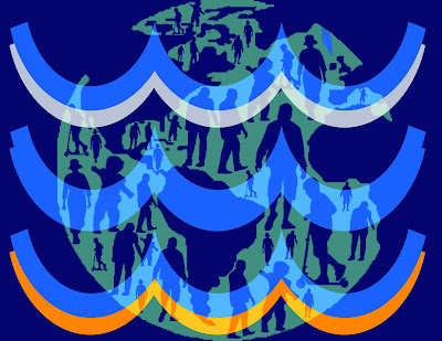
For this assignment I used a lot of my previous knowledge of photo shop techniques.  For example turning a photo into a brush, which I used for the people that I erased out of the earth.  I also used the layer blending option to change the style of the layer.  I used this technique on the vector of the world so that you were able to see it through the the coloured waves.  I also used the shape tool to create the water waves in my flag.

Idea/Concept
The idea that I eventually used for this assignment was to show that throughout the world people are equal and connected.  I showed equality through the people in the world, by showing people of different age groups in different sizes throughout the world.  To show the connectedness of the world I tried to incorporate the four elements through the water symbol and the colour I used in my flag.  While doing this assignment my idea changed a lot since at the beginning I had almost no idea of how I wanted this to look.  From the beginning I knew that I wanted to show that the world was connected in different ways and that everyone in the world was equal.  The original idea that I had started with was to show that everyone was equal by hands around the earth in different colours.  However this idea was extremely complicated and I was having troubles making the image look connected.  So in the end I decided to show equality through the people in the world, and show that they are connected through the elements. 

Influences
For this project there was no particular artist that influenced me.  However, I was really influenced by wanting to show equality of all people of different races, cultures, ages, disabilities etc. 

Composition
For this assignment I balanced my flag symmetrically.  I think that by balancing it symmetrically it helps keep my flag look simple as it is supposed to.  In this assignment I put emphasis on the waves of water by making them the largest item of the flag and by putting them at the front.  However, you can still see the world in the back due to the layer blend.  The layer blend also helps to move your eye around because even though you automatically see the water waves, your eye is drawn to the background of the picture since you can see it through the waves. 

Motivation
Beyond fulfilling the requirements for this assignment, I was motivated to show that even though there is poor countries in the world, everyone is equal and connected in some way.  I was motivated to show this because some times people forget about these poorer countries and just believe that our world is connected through Internet or phone; although not all countries or people in the world have these luxuries.  So I was motivated to show that the people and countries in our world are connected by much simpler things, for example the 4 elements.

Critical Assessment
I feel that the most successful and interesting element of my piece is waves of water in the front.  I think this because it does an excellent job of showing the elements through the shape and through the colours used.  The one thing that surprised me was how well changing the layer blend of the world connected the piece.  This surprised me because before I changed the layer blend I thought that making the piece come together would be extremely difficult because the pieces did not look connected, and then when I changed it, they looked like one.  With additional time I wouldn't change or add anything because I think that if I changed anything it would look to complicated. 

Monday, 3 December 2012

Part 9: Art Resume

Emma Illerbrunn
Formosa Ontario, Canada
emma_12@live.ca
ww.krop.com/emmart12

Education

2009-Present: Sacred Heart High School
          Grade 9, 10, 11 Visual Arts
          Grade 11, 12 Media Arts


Employment

Summer 2011: Babysitting
          Teaching kids painting techniques and colour combinations

Summer 2012: M&R Burger Box
          Decorating and serving ice cream desserts

Sept. 2011-Present: Sandy's Family Restaurant
            Decorating plates for serving dessert


Volunteer

2010: Decorating 
          Helping to organize and decorate for a formal dance

Friday, 30 November 2012

One World Flag Brainstorm

1. Do a Google search of World Flags. How many colours does the average flag have? What are some characteristics of flags? (Ex. Solid colours, clean edges).

The average flag has 2-4 colours, however most flags have dominant colours with areas of other colours throughout the flag.  A characterisitc that these flags contain is simple graphics and symbols, with clean edges and no tones.

2. Brainstorm five words that make you think of world unity. Beside each word, write the name of a picture that could represent the idea of world unity.

1)Multicultural: hands or people of different races
2)Together: hands connected around the world
3)Equality: showing all people and cultures
4)One: world connected together in different ways
5)Shared: hands holding the world

Thursday, 29 November 2012

Interactive Architecture Reflection

Technical
In this assignment I used a lot of photo shop to edit my original picture of the cafeteria.  One new photo shop technique that I used was the lens flare filter under render.  I used this to make the lights look more realistic like they were actually lit up not just coloured panels.  I also used flash for this assignment to make the lights flash in a wave, and the tablets appear on the tables.  For this nothing in it was really new, it was just a lot of recall from previous times.  To animate the cafeteria I used motion tweens for each panel and table covering to make them fade in and out.

Idea or Concept
The idea that I eventually used for this piece was to have lights covering the walls that flashed with music to help keep up the energy level of students in the cafeteria.  I also used the idea of having tablets on the tables so students and teachers could use them to play games to relax and let off some stress from the day.  Surprisingly my idea stayed the same throughout this assignment since I followed through closely on my original idea.  

Influences
For this assignment I was influenced by the interactive pieces we looked at, at the beginning of the assignment, especially the Luminous Ceiling and Ocean Of Lights.  I found that these pieces influenced me the most because they connected the most to what I wanted to include in my piece.

Composition
In this assignment I tried to balance my colours symmetrically throughout the picture so that one side would not over power the other.  However since the other picture was balanced asymmetrically my final piece was as well.  I think that with the flashing of the lights in the background that really helps the viewer to look around the entire piece.  I also think that the tables fading in help with this since they are drawing the viewers eye down while the lights draw the viewers eye up and across.

Motivation
For this assignment I was motivated for the chance to be able to show how I would change one part of the school to make it more exciting for the staff and students.  I was really exciting to be able to put my own little twist on a part of the school in a way that would be beneficial to everyone.

Critical Assessment
I think that the lights flashing in a wave are the more successful part of my final piece.  I think this because they look very realistic due to the use of the lens flare and because since they are flashing it looks more exciting.  I think that how well the lights turned out was very surprising to me, with my extremely limited knowledge of flash and how my lights looked at the start, I was quite surprised and very happy with the way they turned out.  With additional time I definitely would have added music to my piece so that it could have fully shown my original plan to have the lights flashing to the beat of music.

Monday, 19 November 2012

Part 8: Usability

A) Yes, the navigation's on my portfolio design are easy to find read understand and click.  The navigation's are easy to fin and read because all the titles are typed in bright colours and easy to read fonts.  They are easy to understand because in my starting design I used titles that were easy to understand what would appear when they are clicked on.  However when creating my portfolio I may decide to change the title names to make them more creative.  Finally the navigation's are easy to click on because when I designed it I made sure to chose large areas so that no matter what device the viewer was using there would be a big enough space to open each page.

B) Yes I think my design does a fairly good job at telling people where they are.  I have done this by including the title of the page visibly on the page.  However, when I create my portfolio I will include my name and a return button clearly on each page, as right now they are not visible.  

C) I think that the information about me and my work is very clearly and legibly presented.  I think that the profile information is legible and very clearly presented.  I think that by having it fill the page the viewer can focus strictly on that and is not distracted by background text or photos.  When I finish and include my art resume and artist statement I will go with the same idea, of limiting background information to keep the viewer focused on my information.

D) The design for my portfolio is very creative through the colour scheme, and overall theme of my portfolio.  I think that by using a bright colour scheme and the personal theme of fall and outdoors, I have made a personal and creative portfolio.  I think that by connecting my portfolio design to something personal that it will help it to stand apart from the crowd.  I also think that by shaping the things included into my theme (ex. the art photos being shaped like leaves) that it will be seen as original and different from the crowd.

Part 7: Sketch It Up Continued

Profile Part 1

Profile Part 2


Monday, 5 November 2012

Part 7: Sketch It Up


This would be the first page of my digital portfolio.  The leaves that are falling would be an animated intro, as it would start with them falling down.  The leaves with the titles "My Art" and "Artist Statement" would stop falling, while the leaves in the background would continue to fall continuously in the background.


Wednesday, 31 October 2012

Interactive Art: Mood Board

Interactive Art: Brainstorming

1. What area of the school could really benefit by coming alive?
1) I think the area of the school that could really benefit by coming alive would be the cafeteria.  I think that the cafeteria would benefit from being intereactive/ coming alive because it is very plain and unexciting for students.   I think that by making it fun and interactive, it would help to boost the energy level of the many students in the cafeteria. 
b. How could this space be brought to life? (ex. what kind of theme? lights, sounds,
textures?)
2) I think that this space could be brought to life by giving it a fun, music based theme.  As more people entered or exited the cafeteria the volume of the music playing would change.  There would also be lights flashing from the walls that matched with the beat and volume of the music.  The tables would also be interactive at each setting, turning on only once someone is sitting in the chair at the spot.  The spots interactive at the table would enable students and teachers to be able to relax with a game, doodle etc. to lighten the mood or relax them.
c. What would the message of this space be? What will this piece of art create a conversation with the viewer? How will your interactive piece be especially important for teenagers and our Catholic community?
3) The message of this space would be that it is a fun place for students to relax and come to boost their energy.  This piece of art will create a conversation with the viewer therough the lights that would be flashing on the walls according to the music.  This interactive piece will be especially important for teenagers and our Catholic community because it would help the students the relax and relive stress.  I think that this is extremly important for teenagers since being stressed or overwhelmed can lead to very bad things.
 
d. How would the viewer be able to interact with your piece of art?
4) The viewer would be able to interact with my piece of art in many different ways.  One way that the art would be interactive would be through the students/teachers walking through the door to adjust the music.  They would also be able to interact with the digital screens on the tables. 

Monday, 29 October 2012

Interactive Art: Video Relfections

Monomyths Video
1) My favourite part of this group is the room with the mirror with the delayed movements.  This was my favourite part because I think it is the most interesting for the person participating since you are not restricted, you are free to do whatever you'd like.  I also think it would be interesting since you would be able to see what the people before you have done.

Luminous Ceiling
2) I think that this could be considered interactive because when people are walking under it they will feel like the piece is taking them to space, interacting them.

Ocean of Lights
3) I think that this could be considered a piece of art because like photographs, light is just a different medium for this group to make something that appealing to the eye, and thought provoking.

Ad Buster Reflection

Technical
For this assignment I used many different techniques.  One new technique that I used was the liquify tool.  I used this tool to make the logo on the can into a foetus.  I also used a tool under liquify to make the label more rounded so that it would wrap around the can.  I also used urbanfonts.com to find a font that matched the font on the Pepsi can, to be able to change to the flavours and add the text on the can.

Idea/Concept
My idea for this assignment was to show that PepsiCo was using foetal cells in their new drinks.  The idea that I eventually used was to modify the Pepsi Next advertisement into showing that the new drinks are made using foetal cells.  I did this by changing the new flavour names into names related to babies and foetal cells.  My idea did  develop a little bit, but not drastically.  My idea was to always show that PepsiCo was using foetal cells in their drinks.  However I did change the original as that I was using, from the "Some things were just born to be" advertisement to the Pepsi next advertisement.


Influences
For this assignment my influences were ad busters, and the pro-life vs. pro-choice debate that Mr. Smith and Fr. Jason had.  Ad busters influenced my piece because I was able to use some of the techniques used in those ads in my own.  The debate influenced me because I had other possibilities for this assignment, but after the debate I really wanted to do something related to abortion, so I chose the PepsiCo scandal. 

Composition
For my piece I balance everything asymmetrically.  The eye moves around the image since the most emphasis is placed on the pop can to the right of the image, but the eye still moves around to the pop cans in the background.  This emphasis helps each individual piece because the viewer focuses on one piece enough to understand what it is showing, and then it can do the same for all the pieces.  This also works for the image as a whole because the viewers are not just looking at one part of it, they are looking at the whole image.

Motivation
For this assignment I was motivated to show what PepsiCo was doing with the foetal cells.  This motivated me because I thought that it was absolutely disgusting and wrong that PespiCo was the flavor enhancement testing with foetal cells.

Critical AssessmentI feel that the most interesting aspect of my piece was the change of the Pepsi logo into a child in the womb.  I think this really pushed it over the edge to make the viewer see what Pepsi was doing.  The logo was also the part of this piece that surprised me.  I was very surprised at how much this really put the piece over the top and finalised what I was really trying to show.  With more time I don't think there is anything that I would change, I am very happy with the way that this piece turned out.

Thursday, 18 October 2012

Culture Jammer Brainstorming

For my culture jammer assignment some possibilities I found were Walmart's use of sweatshops, Gap's use of sweatshops and Pepsi Co's use of foetal cells from aborted babies in flavour enhancement research.  For my assignment I chose to use the scandal with Pepsi Co, since I think it is one that most people would not have knowledge about.  For this assignment I will be using the Pepsi logo, as well as incorporating pro-life logos and slogans to help emphasise the scandal.  I will also be using a Pepsi advertisement showing an unborn child drinking Pepsi with the slogan "Some things were just born to be."  I will use this advertisement as a base and use the magic of photoshop to turn it against Pepsi Co.

Monday, 15 October 2012

Culture Jammer Commentary

1) This advertisement represents/subverts Absolut Vodka.
2) Absolut Vodka is being advertised in this advertisement.
3) The imagery that is used in this advertisement is showing a dead body in a morgue.
4) The text message used in this advertisement is "Absolute On Ice" which some could take as the drink on ice, or in this case it takes on the meaning of Absolut Vodka cause death meaning the person is on ice.
5) The target audience of this advertisement is the consumers of Absolut Vodka.
6) Yes I think the ad jam does convey a clear and successful message.
7) I think the ad jam could be improved by making the foot with the tag stand out more the make the message a little more clear.

1)This advertisement represents/subverts McDonald's.
2)The product that is being advertised in this advertisement is fast food, specifically McDonald's meals.
3)The imagery used in this advertisement is showing the hazard sign on the french fry box.
4)The message being conveyed through text is the hazard symbol on the fry box because even though it is not words a symbol can convey the same message.
5) The target audience for this advertisement is constant consumers of McDonald's food.
6) I think that the message being conveyed is somewhat clear making not as successful as it could be.
7) I think that the ad jam could be improved by making the message of special ingredients more prominent than just the hazard symbol.
1) This advertisement represents/subverts Nike.
2) The product being advertised is Nike running shoes.
3) The imagery used in this advertisement is showing the shoe only part complete.
4) The message being conveyed through text is the writing on the shoe showing the price it costs to purchase the shoe compared to the wage a sweatshop worker will make for making the shoe.
5) The target audience for this advertisement is anyone who is interested in Nike products.
6) Yes I think that the message is being conveyed very clearly and successfully.
7) I think that the ad jam could be improved by adding colour to parts to make them more prominent.
        
1) This advertisement represents/subverts Tommy Hilfiger.
2) The product being advertised is all Tommy Hilfiger clothing and products.
3) The imagery used in this advertisement is showing the sheep gathered in front of an American flag.
4) The message being conveyed through text is only that this advertisement is about Tommy Hilfiger as there is no other text.
5) The target audience for this advertisement is anyone interested in purchasing Tommy Hilfiger products.
6)Yes I think that the message is conveyed clearly and successfully.
7) I think that the ad jam could be improved by adding more text to emphasise the follow the herd message.

Thursday, 11 October 2012

Post Apocalyptic World In 3D Reflection

Technical
During this assignment I used a lot of the same steps that I had used before including using brushes, downloading brushes, and changing the hue and saturation of the picture.  However one new step that I used a lot while completing this assignment was creating brushes from pictures.  I had used this step before but never very often and for less specific brushes than in this piece.  I think that by creating my own brushes for this piece it made completing it to my preference was much easier.

Idea/Concept
For my final piece, the idea that I used was to show that a possible cause to the end of the world could be a flood.  In this idea I wanted to show that by having the world end by a flood the only thing that would prevail would be water animals and some aspects of nature.  In this art piece I was hoping to show that even though people seemed to be prepared, for example by having a boat, the only thing that would last through the disaster would be things from nature.
For this assignment my overall idea of having the flood end the world did not change.  Although my idea of what I wanted to really emphasise changed from wanting to really have to water and the cause stand out to putting the emphasis on the positive of what would survive the disaster.

Influences
For this assignment I didn't really have any specific influences since I do not know of many 3D artists.

Compostion
For this assignment I balanced everything asymmetrically.  The eye moves around this piece of work by having the colours evenly throughout the entire picture.  This makes the eye move around the picture because the prominence of some colours is mixed through the picture drawing your eye around.  The emphasis of the different colours works for the individual pieces because the red object are prominent drawing your eye there and then making you look at all the objects around it.  It also works for the piece as a whole because since the red objects move your eye around you are able to see everything in the piece.
 
Motivation
My motivation for this assignment was to explore the 3D colour pallets.  I really liked doing the 3D part of this assignment because I found it very interesting how using the right colours on the right background could make your picture 3D.
 
Critical Assesment
I feel that the water fall and the house falling off of it are the most interesting and succesful because I think that with the colours they really stand out and look the best.  No there wasn't really any parts of this process that surprised.  With additional time I would improve the fuzziness around some of the edges of the really 3D parts.

Under/Over Exposed Photography


Tuesday, 9 October 2012

Homework Step 5 What Is a Conceptual Portfolio Design

This is a conceptual portfolio design because it is set up differently with the book being opened.  It also has a more colourful design rather than being very neutral like a professional portfolio.
 This design is very conceptual because of the idea of using the sketch book.  It is also conceptual because it is very person to the person who created it and is not completely focused on the art.
The colour pattern of this portfolio makes it conceptual.  You can also tell that it is a conceptual portfolio based on the fun and playful images.
 This is a conceptual portfolio because of how personal it is, by showing the rather abstract images. It is also conceptual because it includes a chat.
This is a conceptual portfolio because it is very personal to whom ever created it.  You can also tell from this portfolio that it is meant to show off personal things with easy access for family and friends.

Post Apocalyptic World In 3D

Thursday, 27 September 2012

Monday, 24 September 2012

Post Apocalyptic World In 3-D Brainstorming

A.  I think a possible end of the world could be caused by a natural disaster such as a flash flood caused by global warming.  I think this particular disaster would affect the physical environment in good and bad ways. A flash flood would be bad for the environment because the water damage would eventually destroy everything, things that are natural and man made objects.  However it could also be good for somethings that take extreme amounts of water.

b.  One particular aspect that I would like to show in my piece of art is how the world has been rebuilt with the understanding of how important it is to look after the environment.  My picture will portray how people have become much more resourceful and conscious of their decision.

c.  Ten things that would survive my disaster would be a lot of the wildlife such as trees, plants etc.  Animals would also survive especially aquatic animals such as fish, otters etc. A few human would also survive the flood if they had the proper resources such as a boat. These things in particular would survive because they would be the only things capable of surviving the flood.


d. A symbol of hope for my picture would be the trees and plant life that survived. 

e.  I think their art is very interesting and thought provoking as to what our future lives will be like.  I think that their art is appealing to others because of the interesting way things from modern day is being incorporated into a much simpler lifestyle.

Thursday, 20 September 2012

Building A Digital Portfolio: Part 2; Elevator Pitch

First Assignment:
Emma is full of original ideas and completes everything with creativity, punctuality and enthusiasm.

Second Assignment:
A) Emma is good at creating pieces of art that include very original ideas.  All of her art work is completed with exceptional levels of creativity and individuality.  Emma is also extremely punctual and always ensures her pieces are submitted on time.  Emma enjoys and is good at creating artwork that draws many thoughts and interpretations from all viewers.

B) Emma has used basic photo shop and photo editing programs before but would like to become better at using full versions of these programs.  Emma would also like to improve her ability to balance the colours and images in her artwork to make it more appealing.  Improving her ability to use animation programs is something else that Emma would like to do.  Emma would also like to improve on expanding the themes of her artwork.   

I am a creative and original person, looking to expand my photo shop and photo editing skills.

Monday, 17 September 2012

Handmade Assignment Reflection


Handmade Photoshop
Assignment Reflection
Emma Illerbrunn
Photography/Photoshop
Monday, September-17-12
Technical
During this assignment there was only one new technique that I used, which was changing the style of the layer (from normal to colour burn, multiply etc.).  I found that this technique really helped me to get the look I was hoping for in the assignment.

Idea/Concept
The idea that I eventually ended up using for my work was to follow a country and nature theme while still including a handmade aspect.  For the country and natures aspect of this idea I used photographs of country scenery for background pictures.  To help include the handmade aspect in my work, I tried to incorporate many different doodle brushes, fonts and handmade looking objects such as ripped paper. 
Throughout this assignment my idea did change and develop a little bit.  My original idea was to have an old and antique themed cover, by including pictures of older items, using typewriter fonts and filters to make the entire thing look older.  After working on this assignment for a little bit my idea changed to doing a rustic nature and country theme, by using filters on top of photographs of nature and country scenes to make them look older.  However, after much difficulty with this idea and not being to do with it as I intended I switched the idea that I ended up using for my final piece.

Influences
For this assignment, I did not have a visual artist as an influence, however I found that the style was influence by the artist I picked to model my CD cover for, Taylor Swift.  I found that while working on this assignment I often found myself trying to relate the style back to the artist and the music it would be for, and since Taylor Swift’s music all has some country in it, I was greatly influenced to use a country theme for my piece.

Composition
For this piece I chose to balance it asymmetrically since I find that easier for myself to create interesting and eye-catching pieces.  On the front part of my CD case, I think your eye moves around because of the placement of the brushes and by using the colour of the brushes which I was able to achieve by using the Vivid Colour style on the layer.  I also think that the ripped paper the title is on helps to move your eye around to piece because of the way the edges are jagged and pointing in different directions. 

Motivation
Beyond filling the requirements of this assignment, I was motivated by the idea of the assignment, to use the computer to create something handmade.  At first I thought this sounded very controversial, but then saw it as an interesting challenge, which greatly motivated me.  By seeing this as a challenge I was motivated because I saw this as a way to push myself and to try something new.

Critical Assessment
I feel that the most interesting and successful part of my CD cover is the title positioning and style.  I think that this makes it the most successful part of my cover because with the colour and positioning it really makes the title easy to see but it does not take away from the background of the case.  With additional time I would have worked more on the back of the case to make it connect and match a little better to the front.  I also would have spent more time to make the back more creative with more photos and brushes.  
Handmade CD Cover/Back Photos


Monday, 10 September 2012

Building A Digital Portfolio: Part 1; Strategy

A) I think that when family, friends and art schools are looking at a digital portfolio they are mainly looking to see many art pieces you have created in a variety of styles.  I also think they will be looking to get a sense and a feel for who you are through the style and through an “About Me” section.  However, some people will have different reasons and intentions for looking at a digital portfolio.  For example, an art school would be looking at the portfolio they would want it to be neat, organized and contain a future plans section.  This would differ from what when family and friends look at, since they may be looking more for self-expression and fun animation items.

B) One thing that would make a digital portfolio stand out from the crowd would be to make it more personal and connected to your life.  Including photos you have taken of a favourite place, your home environment etc., would be one way to make a digital portfolio personal yet still be professional.  Something that would surprise the audience and make a portfolio stand out would be to include interesting animations or soft music in the background.  If the portfolio is specifically for an art school, you could catch their attention by creating a very professional portfolio, showing your skills and abilities in and interesting and appropriate way.  Although if the portfolio is specifically for family and friends you can catch their attention through fun animations, pictures etc.

C) My audience’s world is very chaotic, busy and stressful, so for these reasons I would like to create a calm, relaxed mood for my portfolio.  I would like to be able to create a mood where people viewing my digital portfolio can relax, let off some stress and maybe even have a little fun.  I think that having a calm and relaxed mood for my portfolio will help people to really enjoy looking through everything and possibly have some fun with the animations and photos. 

D) My audience operates in a realm where the craft and quality of the work would be held above clear communication.  I think that my audience would be looking more to see the quality of the work because they understand that art is supposed to be something available to different interpretations so a message should not always be clear.  The audience that I am trying to target will not be looking for something to the point, they will be looking for something that will make them think.  I am also trying to target an audience that will be looking at the quality of the techniques and materials being used, not how effectively a message is being portrayed. 

E) For my intended audience I think that originality will be more important than following others and what they have found successful.  With this in mind while creating my digital portfolio I will incorporate as much of my own photography and ideas.  I will also make my portfolio personal and self-expressive to help make it more original and creative.  I think that by making my digital portfolio very personal and connected to myself it will make it more creative and original, which will make it more appealing to my viewers.

Monday, 23 January 2012

Yearbook Summative Reflection Continued

2. What do you think could be improved about your designs?

One thing that could be improved in my yearbook design is the use of the theme of the locker door on my theme page.  I think that this improvement would make my yearbook page better because it would make my theme more evident and easier to understand for the viewer.  I would also improve the background on my art page by adding more brushes leaving less blank spots.  I think that this would improve my page because it would help the viewer's eye to move around the page not be stuck at blank spots.

3. What do you think makes your designs unique and competitive to be selected for the real yearbook design?    

My yearbook design is unique and competitive, because it has a theme that can easily students of all grades, and teachers can connect with.  I think this makes it competitive to be selected for the real yearbook design because by being able to connect and understand the yearbook, students would enjoy it more and be very happy with it.  

Friday, 20 January 2012

Yearbook Pages


1. What do you like most about your designs? 

What I like the most about my yearbook pages is the use of brushes throughout the pages.  I like this because I think it helps to show my theme of being original and making things your own.  I also like the colours of my pages. I think that by using similar colours helped to make my pages easy to look at.  I also like the colours because since I used the colours for only brushes and background items my pictures and fonts were very easy to see on my pages.

Monday, 9 January 2012

Yearbook Summative Brainstorming

A theme for my yearbook pages could be a students locker included with the idea of endless possibilities.  Having locker doors on the front cover would be showing the beginining, offering the idea of exploring the options.  On the inside the pages would be designed to look like the inside of a locker including hooks and photographs taped on.  Endless possibilities would be shown through the difference on each page, which would show making something yours, being able to create anything you want.